Visualising Changes to Rail Services
This post is about the Timetable Changes tool I built to help understand how upcoming changes to the train timetables in the UK would affect me.
Update: The May 2018 timetable changes didn’t go so well. I’ve since updated the tool to show changes planned for May 2019.
The May 20th changes
From Sunday 20th May 2018 a lot of the timetables for rail services in the UK are changing. For some routes the changes are small. For others, particularly in the South-East, the changes are more dramatic. Great Northern, Thameslink and Southern services are all changing as part of the Thameslink Program.
For Great Northern (the service I use), this means that all services have been re-timed and many trains will now go through St Pancras and Central London rather than terminating at Kings Cross.
PDF timetables
As someone who uses trains almost every day, I wanted to see how the journeys I make would be affected. I tried looking up the new services using a journey planner and on the hard to follow PDF timetables but neither gave me the insight I wanted to know- I didn’t care if the 7:46 morning service departed 3 minutes later, what I did care about was how the general frequency and journey time of the new services compared to what they were like now.
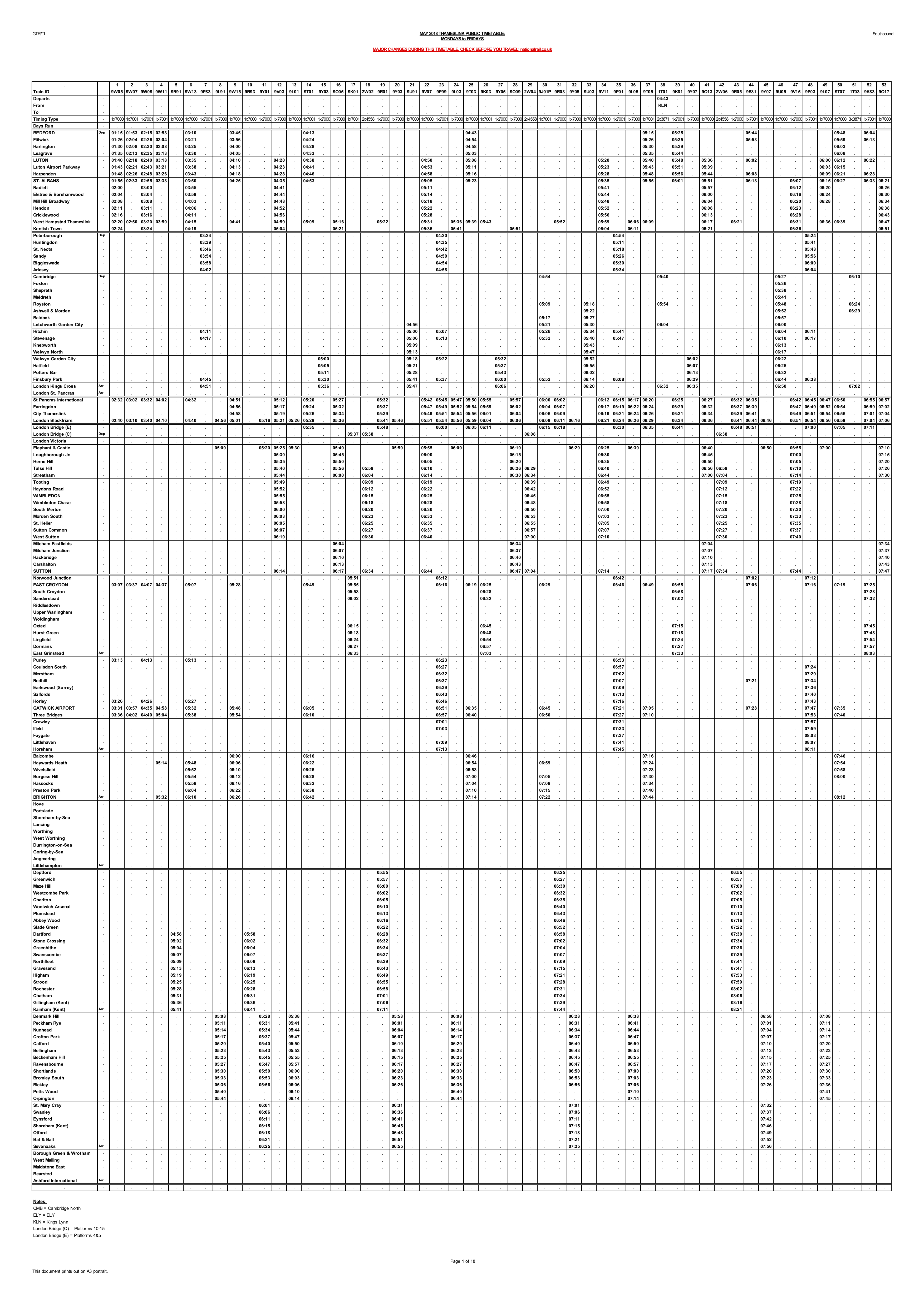
Visualizing a timetable
I remembered seeing graphical displays of train schedules in Edward Tufte’s The Visual Display of Quantitative Information. The first known use of this diagram was by Charles Ibry in the 1840s and was later used in the 1880s by E.J Marey. I have heard these called ‘train graphs’ or ‘Marey charts’.
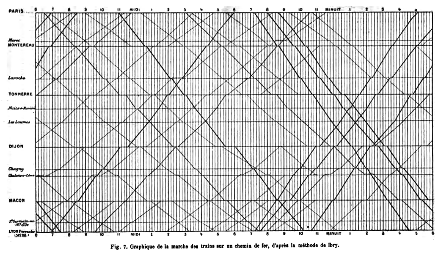
This diagram lets you compare the arrival and departures times of many services at a glance. The slope of each line also indicates relative speed of a service. More recently this style of diagram has been used to visualize data from the Boston Subway and to help investigate a problem with a train on Singapore’s MRT.
Showing the services
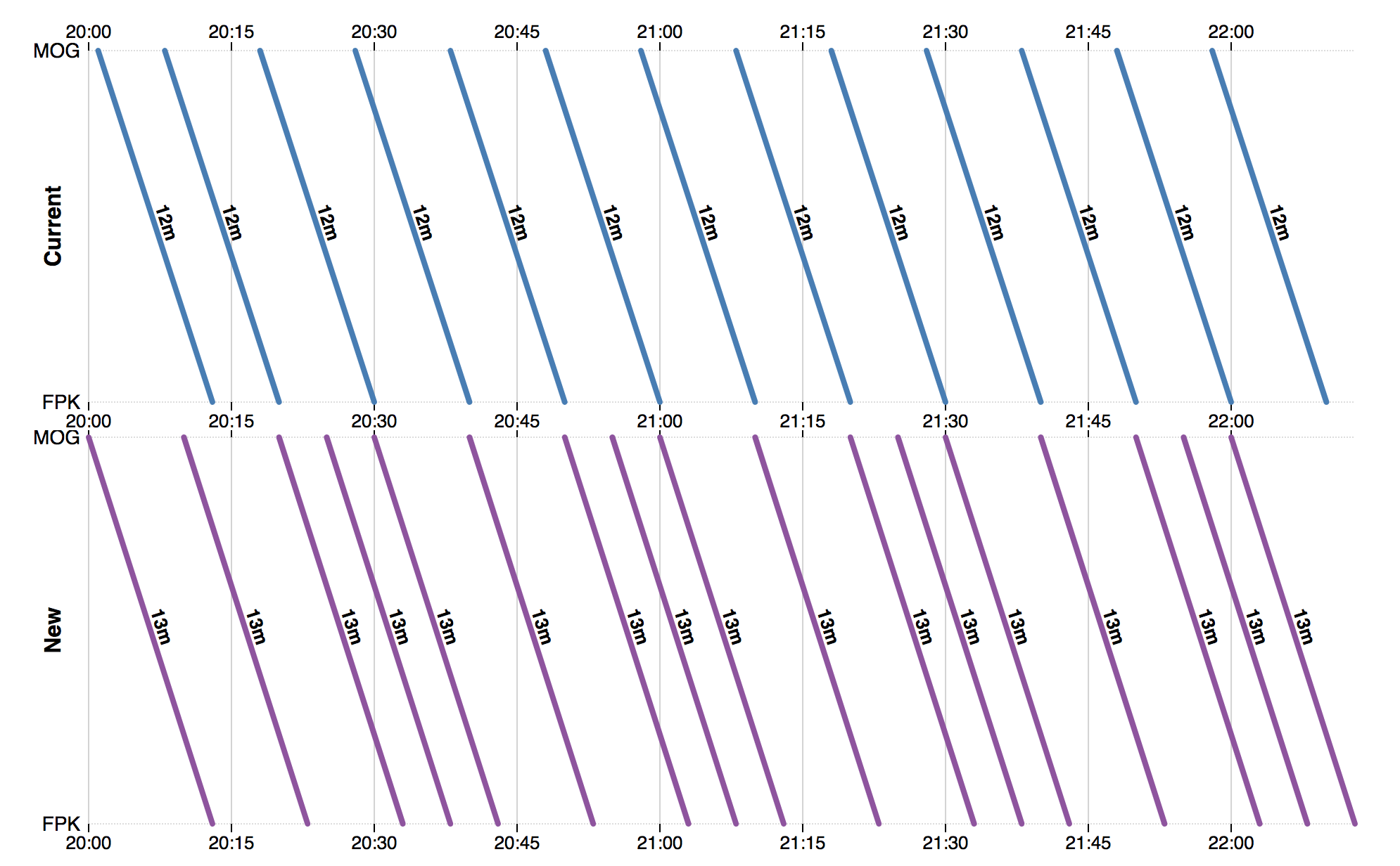
Taking inspiration from Marey, I was able to display the timetables in the way that I wanted. I retrieved the timetable data I needed from the transportapi service and used D3.js to display it. By drawing the chart for the new timetable below the current one I made it easier to compare the two.
I greyed-out services that were overtaken since you would normally wait for next faster service rather than travelling on them.

The new chart shows me exactly what I want, and I can begin to see patterns in the service which weren’t obvious before. For instance, the worst time to get to Kings Cross/St Pancras would be after the 17:54 service has departed since it has the longest gap until the next one.
You can use the tool yourself to produce charts for any direct rail journey in the UK. The code is also available on Github.
July 2019 Update: I’ve since corrected this post to attribute this style of diagram to Charles Ibry rather than Marey.
You can read more by me, follow me on Mastodon or subscribe.

I've just published my book - Build a Database Server. Learn how real databases like PostgreSQL and MySQL work by building your own database from scratch.
Find out more and see a preview.